 In the 1400s, the town of Bures was terrorized by a dragon. Loosed in the village, the dragon breathed fire, killed a flock a sheep, and was impossible to slay. When something isn’t understood, the impulse is to search for understanding by using stories and myths. What is rooted in the ordinary becomes extraordinary through perception: stories grow and local legends shape themselves into myth. Instead of a fire-breathing dragon, the truth is probably smaller. It was more likely that the dragon was a crocodile that escaped from the menageries at the Tower of London.
This intertwining of mythology and reality can be seen in Abi Stevens’ artwork. She uses these competing stories and historical art forms to inspire her work. Abi’s portfolio is filled with richly-detailed posters and covers.
My biggest artistic influences come mostly from historical art forms such as medieval illuminated manuscripts and bestiaries, stained glass windows, and historical architecture. I collect photos of architectural details and artworks whenever I travel, and have visited many churches in the UK for inspiration. Although I’m not personally religious I love the rich details, patterns, shapes and colours found in religious art across multiple faiths.
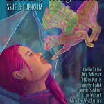
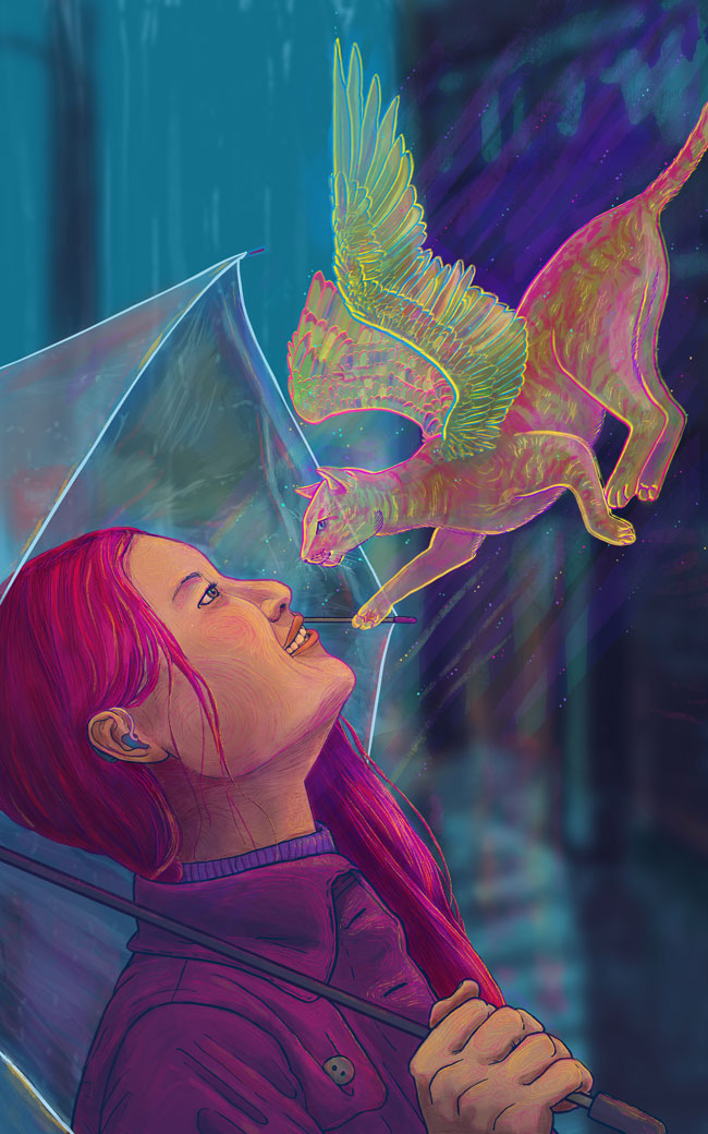
We reached out to Abi because of the colour and animal imagery used in her work. She’s unafraid of bright, saturated colours, and excels at drawing otherworldly creatures. For the Euphoria cover, we didn’t quite have a solid concept. We knew the basics: a young woman shielded by an umbrella looking joyful. However, we weren’t certain how to make the artwork speculative. Originally we thought of strange items falling out of the sky… but in retrospect, it may be hard to feel joyful when frogs are splatting on the sidewalk in front of you. Abi suggested a fae-like cat, encountering the woman just as the rain stops and the sun comes out. The end result is a work unlike anything we’ve commissioned before. The cat glows with neon pinks and yellows. There are subtle swirls and linework in the woman’s face. It’s clear that both cat and human are happy to see each other.
From the first draft, Abi included a hearing aid into the drawing. With every commission we communicate our mission statement, which is to feature more women of colour, more age ranges and body types, and more people with disabilities. Abi took this statement to heart, incorporating her own history and experience into the drawing:
I’ve spent several years working in a special needs school, with many students with hearing impairments, and my mum also ran a hearing-impaired unit in a primary school for many years. I hope that these experiences have made me more accepting of other people, but they’ve definitely made me feel frustrated by the lack of visibility for disabled people in media and the lack of understanding and tolerance that fosters in abled people. When I read about your mission statement, the first thing that jumped into my mind was that I’ve never seen an image of a person with a hearing aid that wasn’t about being hearing impaired, so I immediately wanted to do something about it. I think this is something that all artists should be considering if they create a lot of figurative work and I really appreciate that it’s part of your mission statement.
Abi is using her illustrations to raise awareness of neurodiversity and people with chronic illnesses. Abi’s chronic migraines have shaped her Health series and she is driven to offer her work to raise funds for charities. As a freelancer, Abi has been able to structure her work around functional or nonfunctional hours.
It’s had a big impact on my life as a whole but when I started drawing again I was surprised at first to find how much it changed my work. I started creating migraine illustrations as a cathartic exercise for myself but it’s opened up new levels of meaning in my work and a sense of connection to other people that I really love. I think my work overall now has greater emotional range than it did before.
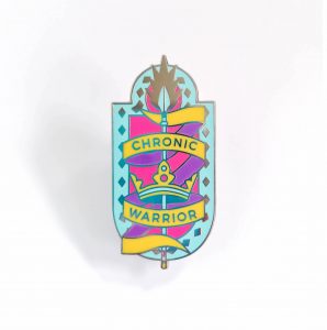
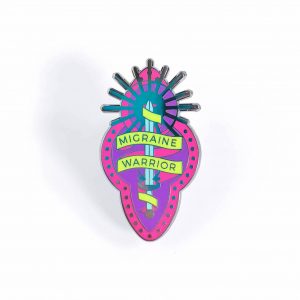
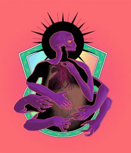
As a side hustle, Abi also produces enamel pins and holographic stickers with a range of Chronic Warrior imagery. The pins and stickers looks like crests and shields and have the same detailed linework that we love in the piece she created for us. It’s the level of quality and beauty that you would expect from Abi Stevens.
Being chronically ill doesn’t stop you from wanting to do all the same things a healthy person does. We might have to do them slower or in a different way, but that doesn’t make the things that we can do any more or less valuable.
Artist Interview with Abi Stevens
Standard interview question: where are you from, how did you start drawing?
I grew up in the countryside near Ipswich, Suffolk, but I moved to Cambridge for university and I loved it here so much I stayed put! I enjoyed drawing as a hobby growing up and art was always my favourite lesson at school, but I didn’t know what an illustrator was until I was doing a foundation degree in art and design. I started working digitally at university and now it’s my go-to medium.
What are some of your biggest artistic influences (both visual/non-visual artists, like writers and musicians)?
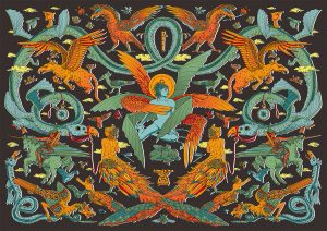 My biggest artistic influences come mostly from historical art forms such as medieval illuminated manuscripts and bestiaries, stained glass windows, and historical architecture. I collect photos of architectural details and artworks whenever I travel, and have visited many churches in the UK for inspiration. Although I’m not personally religious I love the rich details, patterns, shapes and colours found in religious art across multiple faiths. I’ve also recently taken a greater interest in symbolism and have begun including more references to it in my work.
Are there any personal elements (like family history or personal stories) that you try to incorporate into your artwork?
Much of my work focuses on my personal interests but since I developed chronic migraines last year I have created a series of work that explores my migraine symptoms. That’s led to me wanting to put more emotion and personal experience into my work and continue to create strong connections to the viewer. I’m planning to create work exploring other conditions such as ADHD and Alzheimers, and continue to use my work to help spread awareness of invisible illnesses.
What are some of your favourite myths or folktales to work with?
I had a lot of fun last year researching local folklore from the area of the UK I grew up in, such as Black Shuck. I also adore medieval bestiaries for their bizarre creatures and stylized drawings. I’m interested in mythological creatures from all over the world though so there are lots more I’d like to work from in the future.
Colour is a dominant aspect in your work. Why do you find yourself drawn to using these heavily pigmented backgrounds?
I’ve always been drawn to highly saturated colours: I love how vivid they are, how they catch the eye, and wearing bright colours and dyeing my hair makes me feel more cheerful. The use of vivid colours in my illustration work has therefore always been pretty much instinctive. I’ve tried making artwork in more muted tones, or grayscale, but I find it just doesn’t feel like mine until I add some bright contrasting colours!
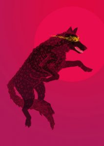
Animals are another dominant image in your work. You really excel at drawing creatures and turning the natural world into something a little stranger. One of my favourite examples is The Dragon of Bures which overlays a crocodile with a glowing dragon. Why are animals such a large focus of your work?
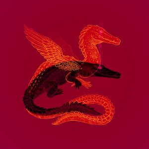 I think it’s largely a consequence of my focus on mythology and fantasy, as most fantastical creatures have been inspired by real animals at one point. The Dragon of Bures in particular is a folktale from a small village in Suffolk. The dragon is suspected to have actually been an escaped pet crocodile from a nearby royal residence. It was a gift from a foreign King and the local villagers wouldn’t have had a clue what a crocodile was back then, but they’d certainly heard of dragons! I find the distortion of real animals into mythological beasts through the power of narrative really interesting and I like to juxtapose them in my work.
Apparition Lit has a mission statement to showcase a variety of body types and abilities. One thing we appreciated was how quickly you took that statement to heart. On the very first draft you included a hearing aid. How did you come to the decision to include this?
I’ve spent several years working in a special needs school, with many students with hearing impairments, and my mum also ran a hearing-impaired unit in a primary school for many years. I hope that these experiences have made me more accepting of other people, but they’ve definitely made me feel frustrated by the lack of visibility for disabled people in media and the lack of understanding and tolerance that fosters in abled people. When I read about your mission statement, the first thing that jumped into my mind was that I’ve never seen an image of a person with a hearing aid that wasn’t about being hearing impaired, so I immediately wanted to do something about it. I think this is something that all artists should be considering if they create a lot of figurative work and I really appreciate that it’s part of your mission statement.
On your website and social media you’re upfront with being an artist with a chronic illness. How does this affect your art? Is there anything you’d want your audience to know about the experience of working with a chronic illness?
 It’s had a big impact on my life as a whole but when I started drawing again I was surprised at first to find how much it changed my work. I started creating migraine illustrations as a cathartic exercise for myself but it’s opened up new levels of meaning in my work and a sense of connection to other people that I really love. I think my work overall now has greater emotional range than it did before.
I’d like people to remember that being chronically ill doesn’t stop you from wanting to do all the same things a healthy person does. We might have to do them slower or in a different way, but that doesn’t make the things that we can do any more or less valuable. Freelancing is a great way to structure my work around my non-functional hours so that I can produce the best work possible while mitigating the physical and mental toll that keeping 9-5 hours can have on a chronically ill person.
What gets you back to working when you’re feeling blocked or uninspired?
I usually find it helpful to talk someone else through my ideas to help me organize my own thoughts, or to switch to another activity for a while, such as going for a walk to clear my head. If I’m still stuck I have to make myself sit down and do as many terrible thumbnail sketches as it takes to find an idea which will work!
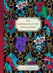 You created original strikingly detailed art for book covers. The cover is often a reader’s first impression of a novel. How do you approach creating a cover that conveys the theme and tone of a book?
I like to do as much research as possible, including reading the book if it’s already available. I mine the text for interesting visual snapshots and often pick out objects of significance to the characters or plot. Depending on the books setting I might look for references in historical art forms which fit. Once I have these anchoring objects/scenes noted down, I’ll often also look into symbolism to find plants/objects etc which reflect themes or feelings within the text. Then it’s just a matter of tying all these elements into a single image!
Some of your posters include intricately designed patterns. What inspires you to create these patterns? How do you keep a design from becoming overwhelming?
The original inspiration for my complex monster patterned pieces was illuminated manuscripts. I’ve seen a couple of fantastic exhibitions of illuminated manuscripts and they often have beautifully intricate patterns of plants, animals, people, and mythological creatures in the borders or as vignettes alongside the text. I was inspired to create my own pattern designs in a modern digital style and incorporating my love of mythology.
The key to keeping them from becoming overwhelming is a careful balancing of shapes and contrasting colour. The symmetry helps with this as well. I start out these illustrations by sketching out rough shapes for the larger creatures and trying to create a kind of flow that can guide the eye from one shape to the next. Then I outline these creatures and draw in the smaller ones around them afterwards to balance out the image. Adding colour is again used to guide the eye as you can follow the cool greens and blues around the image, then the warmer yellows and oranges. The careful arrangement of colour and shape across the image keeps your eye moving and makes it easier to single out interesting details without being overwhelmed.
 For online artists, curating an audience is almost as important as curating an aesthetic — how do you represent your work online? Where do you try to promote your work?
Oh that’s a tough one! To be honest I think I still have a lot to learn about online promotion, but so far I’ve found the best way to increase engagement with your posts is to approach social media like a person rather than a business; engage with other artists, talk about your industry and encourage people to interact with you as much as you can. I also think it’s vitally important to stay true to your own creative process and not stress too much about trying to fit your work into the little digestible chunks social media seems to encourage. At the moment I use Instagram and Twitter mainly, with a portfolio website to direct potential clients to, and a few peripheral social media accounts I update more infrequently.
You’re prepping for your first big con next year. How is this different than prepping for a smaller fair?
My main concern at the moment is the change in scale. Having only tabled smaller events before this, figuring out how much stock I need to prepare for a big con is going to be a risky guessing game which could lead to me running out way too early or being stuck with a lot of surplus after the event! From a more personal perspective I am concerned that the heat, crowds, noise, light, and busier pace of a big con will cause a lot of migraine problems, so the whole things a big experiment really!
What would be your dream project to work on?
I’d love to do a run of book cover illustrations for a science-fiction of fantasy series! I’ve adored reading from these genres since I was little and it would be amazing to have my own work on something like that, to inspire a whole new generation of readers. It would also be amazing to work with the Folio Society to create a cover and a series of interior illustrations for one of their special editions.
Last question! Do you have anything to promote to our readers?
I recently crowd-funded a series of enamel pins and holographic stickers for Chronic and Migraine Warriors! They’re now up for sale on my website at www.abistevens.com/shop. I’m also now offering private (personal use only) commissions. People can find my commission slots at www.ko-fi.com/abistevens.

