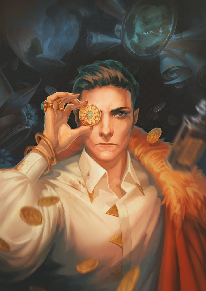
It takes nerve to face something head-on. There’s no flinching in this issue’s cover art. The model resolutely looks ahead, a bloodstained coin lifted to their eye. Their clothes are slightly bloodied, but, as you imagine them stomping throughout a cobblestoned street, shouldering their way through a crowd, you can’t imagine anyone stopping them. This is power, refinement, and charm—all facets of ambition.
I wouldn’t be surprised if you’ve seen Erion Makuo’s art before. The work is often bold, texturally layered, and a little bit glowy. As a freelance illustrator, Erion has produced gorgeous, glorious art across different fandoms. I discovered Erion through their Dragon Age portraits, but Erion has also produced cover art and interior art for Of the Night Zine, Samurai Art Book, Son of Satan the Mortal Coil, and Red Embrace: Hollywood.
When we contacted Erion to create our Ambition cover art, we wanted it to feature a non-binary character. We had in mind a powerful and somewhat dangerous character, someone who would sweep you off your feet and steal your wallet. Beyond that, we had no idea about setting or time period. With luck, Erion was willing to take free rein of the art’s landscaping and stylization. During the second round of sketches, Erion produced background variations and colour schemes—each with their own nuances.
I remember having several ideas, both in terms of composition and color. Trying to juggle both at the same time seemed like a less efficient way to handle this, so it only felt natural to deal with one first and the second one after.
What I immediately loved was that Erion proved a warm yellow light would work best for the cover. However, shading and background colours were still fair game. With just a switch of colours, the impact of the art could change on a whim.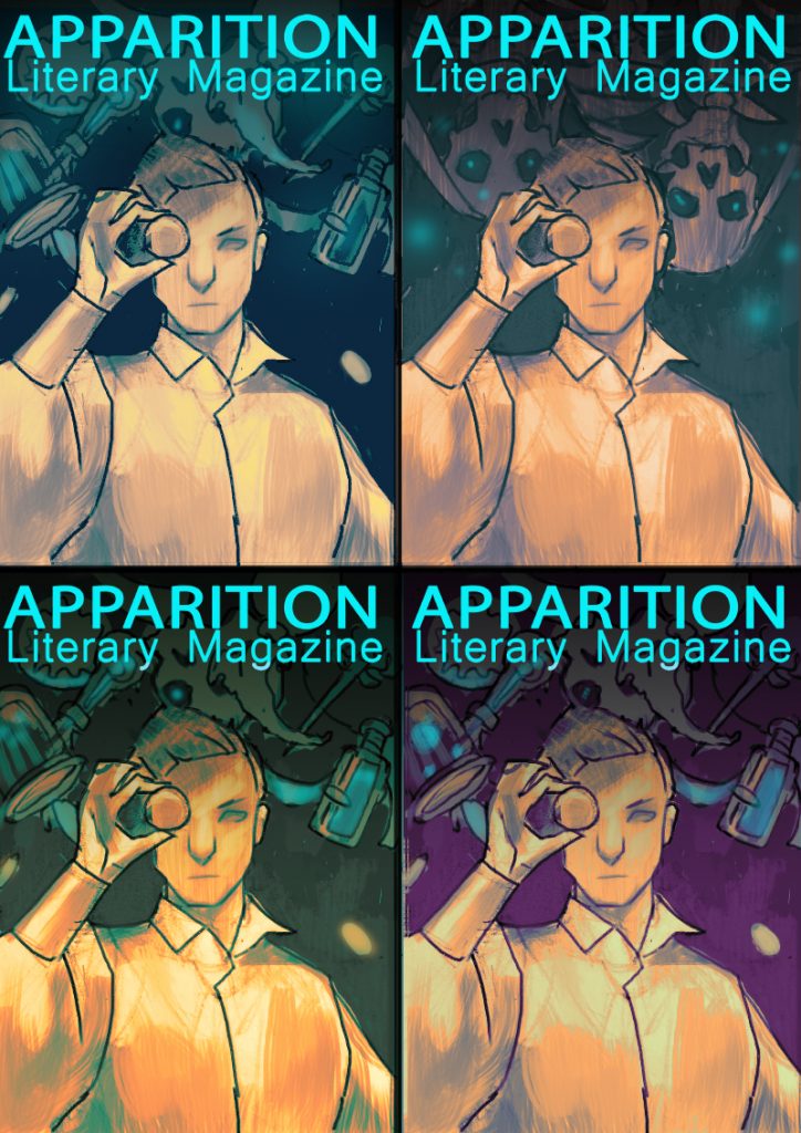
The clothing style that Erion produced was also a surprise, where the sketches featured a coloured shirt, the end result was a gold-embellished shirt with a startlingly lush orange cap thrown over the shoulder. The details in the clothing make it easy to imagine the world that this character lives in. Even better, while the clothing is rich and detailed, there’s nothing expressly feminine or masculine about it.
And designing a non-binary character like that was mostly a balancing act: simple white shirt with a heavy cloak, something a noble man would wear perhaps, but with a generous helping of gold jewelry which is usually considered more feminine. Same thing for the features: short hair and stout expression, but you can still see some softness there.
Creating an original character is a wholly psychological process. Even if there are fiction or photo references to support art, it’s still bringing to life an image that solely existing in the client’s mind. Erion likes to dig into the details of the character, starting with understanding the setting, the colours, then focusing on the pose.
Someone secretive would probably be covering their face or hiding their hands. Someone aggressive would be just straight-on fighting! It’s that part of the job where the artist has to be a bit of a psychologist.
Erion brought our model to life. Not only was Erion interested in creating a non-binary character, they brainstormed an entire world within that artwork. We wanted someone unafraid of their future and fearless when challenged. The Ambition cover is one of our favourites: it’s bold, luxurious, and ambitious as all hell.
Artist Interview Questions for Erion Makuo
Standard interview question: where are you from, how did you start drawing?
Well, I hail from a small-ish city in Siberia, Ulan-Ude. I’ve been doodling for as long as I can remember, even attended an art school for a year before dropping out, but what really sparked my interest in art was video games. Or rather, it was the idea of how I could contribute to these fictional worlds by fanarting. That got me hooked pretty fast.
Are there any personal elements (like family history or personal stories) that you try to incorporate into your artwork?
Perhaps one thing that I like to bring into my work is androgyny. I’m all about cherry-picking traits and behaviours from whatever gender into your own cocktail, so painting characters that do the same really speaks to me.
What are some of your biggest artistic influences (both visual/non-visual artists, like writers and musicians)?
Oh, there are so many. Gosh. Definitely Florence Welch and Hozier when it comes to music, I adore haunting tunes. Yoshitaka Amano-san has to be my biggest influence when it comes to art: his paintings are so luscious and rich, you can probably get drunk just by watching.
When viewing your portfolio – all your work comes across as very finished and professional. Everything from the rendering to the saturation of the colours seems thought out. How did you achieve this professionalism with your work?
Oh boy, that’s such a compliment, thank you! It definitely helps having 100+ adjustment layers of 5% opacity in you PSD. Jokes aside, it’s all the same stuff that everyone hears every time they ask for art advice: color theory, light and shadow, composition. There really isn’t any secret to hard work and grinding.
And I’m still seeing so many areas where I could improve too!
How did you (or what helped you) learn to voice your design decisions so clearly? Or is this something that just comes naturally to you? For example, one thing we really appreciated was your guiding us through overall designs, colour choice and lighting. The greatest impact to the final design was your decision is alter the lighting in the art from purple to yellow.
I think this comes naturally from trying to organize your painting process as much as possible. I am still figuring out how to give structure to the way I work for the purposes of faster completion and less burnout. Like how detailed should the sketch be, how many layers should I separate this into, which brushes should I start with?
Regarding this particular cover, I remember having several ideas, both in terms of composition and color. Trying to juggle both at the same time seemed like a less efficient way to handle this, so it only felt natural to deal with one first and the second one after.
And, well, I just like being efficient. It feels so badass.
When we commissioned you, you were very open to the idea of creating a non-binary character for our cover. What steps did you take to make this character come to life and stand out from typically feminine or masculine features?
As is always the case, reference was very helpful! Looking at the MS/MR photoshoot with Casey Legler really determined the direction for the cover.
And designing a non-binary character like that was mostly a balancing act: simple white shirt with a heavy cloak, something a noble man would wear perhaps, but with a generous helping of gold jewelry which is usually considered more feminine. Same thing for the features: short hair and stout expression, but you can still see some softness there.
You were one of the artists included in the Samurai Art Book, which is a gorgeous collection of art focused on male fantasy characters and creatures. How did you get involved with the project?
Oh, quite simple really! There was a call for artists, and I applied. Unbelievably, Doc Wendigo replied to my entry only an hour or so later, and I was in. I was so giddy! Still am. It was fantastic to be included in the same project with so many other artists that I admire, and it really made me question and figure out what kind of original art I want to create.
Fandom seems to be a huge part of your online portfolio and audience. You create fanart and tweet Final Fantasy XIV, D&D, and Witcher.
Yep, fanart was what propelled me into studying art seriously and then taking it up professionally, and I still enjoy it immensely. I only painted for Witcher in terms of commissions though, since it’s not one of the fandoms I’m in, but I do very much love Final Fantasy and Critical Role, even though I don’t really have time to fanart the latter one much.
Commissions take most of my time these days, but luckily enough, it’s usually people’s D&D and FFXIV characters so that also feels like fanart to me. And I’m ever grateful that my clients continue to entrust their OC children to me!
For online artists, curating an audience is almost as important as curating an aesthetic — how do you represent your work online? Where do you try to promote your work?
I try not to spread myself too thin over social media. Tumblr, Twitter, Instagram, and a portfolio website is really all I can manage efficiently, and even then I’m still figuring Instagram out. I don’t really do anything special in terms of promotion, other than tagging appropriately and doing my best to respond to every comment.
As a freelance artist, how do you balance client requests with your own art style and preferences?
I trust my clients to come to me for the art style that I have already shown in my other work. But sometimes there comes a person that does want something different, and it could be an opportunity to try a new approach to things. Like with this cover! I’ve never really painted this kind of a non-binary character, but I enjoyed it a lot in the end. Either way, I always talk it out with the client and explain my color/composition decisions until we arrive at the idea/sketch that we both like.
Can you walk us through your process when working on commissioned art?
Sure! First step for me is always writing down the major characteristics of the character I need to paint. I heard from an art director that artists are peerless when it comes to forgetting details, so I try to combat that by having an actual list with important features/character traits that have to find the their way to the final picture.
Reference-gathering comes next. I want to have visual aides for everything: pose, face, clothes, weapons, fauna, flora, all the things that will be present in the sketch. I need to make sure to paint them right.
For my private commissions, I always create three sketches for the client to choose from. They’re usually united by the same theme and color scheme, but with different poses and angles. I feel like giving the client a choice like this really helps you nail their character better in the end, plus you get additional practice as an artist! Win-win. I do have to keep myself from over-detailing these too much, though.
The client chooses the sketch they like most, and I do some adjustments if they request them, and then it’s rendering time. This is obviously the biggest part. I start with the background and then slowly work my way from character’s face and skin and clothing to details, all the while keeping the client updated on the progress with a WIP or two. Throw an adjustment layer or an overlay layer to unite the colors and make sure everything looks presentable — and it’s done!
When you’re commissioned to draw other people’s OCs, what do you do to recreate the image that matches the idea that in someone’s head?
Well, reference is a big part of this, obviously. I also like to ask for face claims if people have them, that’s always a good starting point. Other than that, choosing a pose is a big influence on how the character will come across. If I have to paint someone lazy, I would likely put them in a laying down pose. Someone secretive would probably be covering their face or hiding their hands. Someone aggressive would be just straight-on fighting! It’s that part of the job where the artist has to be a bit of a psychologist, I guess.
There’s always a toxic element to fandoms. How do you navigate your passion and your art around other people’s anger and possessiveness?
I’m lucky enough that I haven’t encountered much of this. But, well, I suppose it’s something that all artists face. You just learn that much faster not to internalize the opinions of others and paint for yourself first of all. And hey, I found some good friends by fanarting too!
Where do you hope to see your career heading?
I really hope to work with publishers and do some badass book covers. And of course, working with Wizards of the Coast is the dream of every fantasy illustrator, right? But I also want to start delving more into original art, something on a more creepy and horror-ish side.
Do you have anything to promote to our readers?
Yes! Doc Wendigo, the artist behind the Samurai Artbook, is organizing a new project around the theme of Four Horsemen of Apocalypse. A lot of artists that were involved in the Samurai Artbook are working on this too, myself included, so please be excited! This will be a darker take on our usual illustrations, I think. All the updates are available via the Shaman Publishing Instagram: https://www.instagram.com/shamanpublishing/

