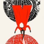
 Red and blue. Opposing colours that work together to evoke meaning and immediately grab attention. If you consider the major movie posters in the last few years, orange and blue are the prime hues used in action films. Orange and blue are complementary colours, meaning that they appear on opposite ends of the colour wheel. Red and blue have often been used in video games to separate different factions: in Mass Effect it was to choose Paragon or Renegade character actions, in Team Fortress 2, the entire arena was stylized with Red vs. Blue pop-art designs.
When you look at Luke Spooner’s portfolio, red and blue are just as much a feature in his work as the bold lines and dark shadowing. Surprisingly, this colour scheme is entirely unintentional. Though blue is often used as a primer or backdrop colour in his work, Luke has never set out to adhere to a specific palette.
Luke Spooner has produced covers and illustrations for books, magazines, and graphic novels. Recently, he created illustrations for stories by big name authors like Neil Gaiman, Clive Barker, and Stephen King. Luke is used to crafting art that matches literary work. As the house illustrator for Gamut Magazine, which publishes neo-noir speculative fiction, Luke has experience adapting his aesthetic to meet the needs of the story. How he interprets a story can vary based on the writer’s style, “[s]ome pieces can be quite concise in the worlds they put forward, offering intricate character details and setting descriptions, while others can sometimes throw you in at the deep end and offer no life support whatsoever.”
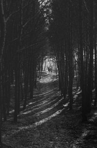
There’s always a sense of unease evoked in Luke’s artwork. Whether it’s two lovers looking at each other or a man in the street, the drawing is altered and made strange. The combination of visible brush strokes and the painterly style of his colouring add depth, shadow and darkness.
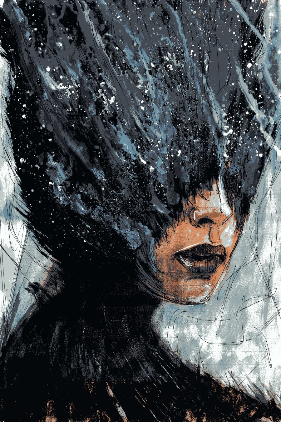
I’m a strong believer in the idea that if you can convince a viewer that something commonplace within their lives is now a source of fear then you have achieved the perfect kind of horror.
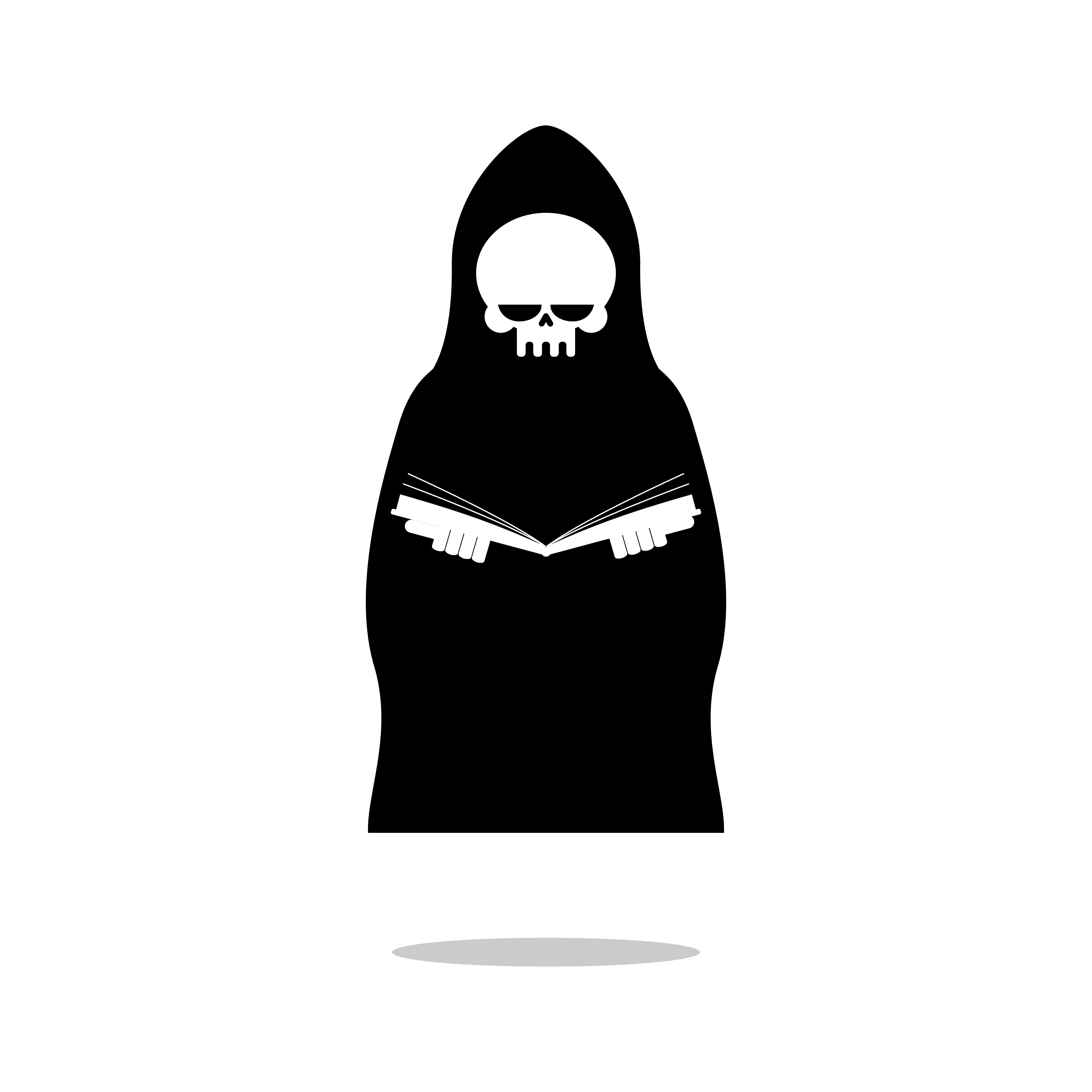
This style extends even to the art that Luke produces for younger audiences. Luke has divided his artwork into two separate houses. Carrion House contains his darker illustrations commissioned by clients and stylized for book covers. Hoodwink House has the kid-friendly pieces that Luke found himself drawing just for fun. Although he enjoys drawing the kid-friendly pieces, Luke still believes that dark and macabre illustrations are the core of this style.
I decided to take a cue from what was already said about me and capitalized on the idea of crows. They too were inherently dark creatures, synonymous with all the sorts of themes and ideas that I hoped my style of illustration may one day also convey…
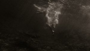
Luke has been methodical building his brand. He works constantly, producing commissioned covers, acting as House Illustrator for Gamut Magazine, and sketching art for his Patreon page. He contacted Apparition Lit with an introduction and an offer to work with us to find a piece that met our style. Quiet Time was originally produced as cover art for a music album of the same name. The darkness that enveloped the model immediately appealed to our editors. Luke designed the piece to play “off the idea that by reducing the number of senses available to you–you end up in a state of quiet.” However, the piece also works as an element of delusion, the tunnel-visioning that can happen as people become fixated on an idea.
Like many creators, Luke has never viewed himself as ‘becoming an artist.’ It was a state of being, something that was always a part of him. He started illustrating at a young age, shaped his passion through education, and continued pursuing it through freelance work.
It’s who I am and runs a lot deeper than simply being an occupation, it’s woven right into my fabric–I have to create and tell stories–it’s as simple as that.
Interviewed by Rebecca Bennett
Full Q&A with Luke Spooner
1. Tell me a bit about yourself. Who are you, where did you grow up?
I live and work in the South East of England and have a First Class degree in Illustration from the University of Portsmouth. My current projects and commissions include illustrations and covers for books, magazines, graphic novels, books aimed at children, conceptual design and business branding. Recent projects have included stories by Neil Gaiman and Clive Barker as part of Gutted: Beautiful Horror Stories and Behold: Oddities Curiosities and Undefinable Wonders, both released through Crystal Lake Publishing, as well as two stories by Stephen King; one through You, Human, released through Dark Regions Press and another through Gamut Magazine.
2. Why did you become an artist?
I’ve always been creating, drawing, painting etc. from the moment I could hold a pencil or brush so I just ended up doing that all the way through school, college, university and now I’m doing exactly the same thing. The difference is that I get paid to do it now. I don’t think I ever ‘became’ an artist because that would suggest I was supposed, or had the option, to do something else. It’s who I am and runs a lot deeper than simply being an occupation, it’s woven right into my fabric–I have to create and tell stories–it’s as simple as that.
3. You have a First Class degree in Illustration from the University in Portsmouth. What would you say was the most important skill/lesson you learned throughout your degree?
I ended up really appreciating that I was an individual in terms of style and method. There is a real notion or hope, for a lot of people setting out on University studies in the creative fields, that by throwing yourself into an area of specific interest, like illustration, you will surround yourself with like-minded people and everything will just ‘work.’
I personally didn’t find this to be the case and instead realized that I didn’t have anything in common with how my peers approached illustration and the idea of visualizing a narrative. I also realized that I didn’t want to have anything in common with their ways of doing things. I consciously avoided imitating people with cool styles and ways of doing things and instead became ok with being an individual amongst a field of individuals which, going into a world of freelancers, is a good thing to come to terms with ahead of the curve.
4. How do you work? When you’re ready to start working on a piece of art, what do you do with your day?
I prefer to be alone for the most part but even more so when creating something. I usually spend a fair amount of time selecting albums to listen to while I work from my ever expanding collection. The type of piece I’m working on often dictates the style of music as well as the order and the length of the records I end up listening to. I also drink huge amounts of green tea and often stand up at random intervals to go outside, take a huge lungful of fresh air, and come back in and resume working.
5. What memorable responses have you had to your work?
My favourite responses to my work are always from the author Jay Wilburn. We’re working on two series of books now quite regularly and when we collaborate we tend to create a very important dialogue that really digs to the heart of what both of us are trying to convey. There’s a mutual understanding, respect and desire to put the narrative first in all respects and I genuinely treasure that.
6. Where does the name Carrion House come from?
When I was at University, during the first year, we did a project wherein each of us had to pick and subsequently research (exhaustively) an animal of our choosing with the goal of illustrating something that represented what he’d learned at the end of it. I was the only one in our year group who picked a crow and thoroughly enjoyed the whole process. I went very deep and very broad in terms of my research and made all sorts of reactionary pieces as a result. I made a crow sculpture as well as a couple of crow based animations and even illustrated some select poems from ‘The Crow’ by Ted Hughes. My research and output became so sprawling that other people started referring to me as ‘the crow boy.’
I traveled forty miles by train every time I had to go to University too so I wasn’t someone who hung around with other classmates at great length in between actual lessons and, as a result, no one really knew who I was. So; I was referred to, well into the second year, as ‘the crow boy,’ or ‘he who doth draw them crows.’ When the second year rolled around we were asked to create websites in aid of creating an online persona for our artwork. As I was not really sure how to refer to my own, constantly in flux, style of work I decided to take a cue from what was already said about me and capitalized on the idea of crows. They too were inherently dark creatures, synonymous with all the sorts of themes and ideas that I hoped my style of illustration may one day also convey and so from ‘crow’ I went to ‘carrion crow’ and from there I went to ‘Carrion House.’ The ‘house’ part was added out of a desire to be seen as a ‘house style’ of art as opposed to an individual human being.
7. You’ve separated your art into two different houses (Carrion and Hoodwink). Why did you decide to do this?
I’d always been very inspired and in awe of children’s books and in retrospect would probably agree to the idea that a heavy dose of them during my formative years lead in some part to my becoming an illustrator. Although I’d always wanted my darker style of work to be the one that found its way to book covers–I couldn’t ignore the fact that I did still draw very child friendly pieces just for fun and also drew some sense of fun from it. I ended up, through a series of events that would merit a much longer discussion, writing and illustrating two children’s books that were published by a UK publishing house and realized that I couldn’t ignore the commercial potential of this style for much longer.
Given how different this new style was in comparison to my darker style of work I knew it had to be kept separate and marketed separately. That’s how my other identity came around and it’s gone on to be utilized over quite a few different series of books and media. The word ‘Hoodwink’ was chosen as I felt like I was lying to people when I donned that child friendly style as I truly feel that my core, default setting is dark and macabre.
8. Blue and red seem to be predominant colours in your art, is there a reason you find yourself drawn to these colours?
I hadn’t noticed that if I’m honest but I have caught myself using blue as a primer and common backdrop colour even if the final piece doesn’t stay that way.
9. What do you do to decompress after a hard day?
My time spent outside of illustrating for other people is spent creating artwork for myself, making music solo and as part of a band, running and exercising, practicing karate, seeking out and appreciating film and video games, reading a huge amount and then drawing some more. I’m not sure that any of that would be considered ‘decompressing’ but it’s what I do.
10. What type of art do you most identify with? Is there a favourite genre or artist?
I get asked this a lot and there really isn’t a straightforward answer. I get inspired by a lot of things, usually on a daily basis and they quite often come out of nowhere in particular. I also tend to research and consume visual media constantly and ravenously so my input of influences ends up being more of a storm or soup than any individual contributor.
11. What themes do you often pursue with your artwork?
I really enjoy getting the chance to warp something that is a common theme or object seen in most everyday lives. I’m a strong believer in the idea that if you can convince a viewer that something commonplace within their lives is now a source of fear then you have achieved the perfect kind of horror. You’ll end up changing the way they perceive that object, situation or idea within their daily lives long after they’ve viewed your piece, read your story or watched your film and that is the essence of great storytelling.
12. Why have you focused your art on fantastical imagery?
Have I? I suppose it’s a frequent theme but I assure you that very little of what is now synonymous with my style or what it incorporates was or is intentional. When I first set out to do what I do professionally I had an online portfolio of work I deemed decent enough to act as an advertisement for what I do and from there I pretty much followed the work. People started coming to me with projects and it’s the themes of those that I accepted and chose to re-exhibit online that determined how my work is perceived. In a way my clients have tailored my portfolio to a greater degree than I have and if it’s the ones that incite fantastical imagery that have perhaps given that tone or vibe. Regardless–I say thank you to them for considering me a safe pair of hands for their story.
13. You have patron’s through Patreon, how do you balance what you want to draw with appealing to your fan-base?
Patreon is a weird platform. I had a few Patron’s when I started, then had a lot more, then had very few and am currently hoping to build the numbers back up. I say it’s weird because there’s often, at least for me, very little indication as to why people stop supporting you or how they find you in the first place. I decided that I make a lot of work outside of my professional practice, that nobody is seeing, so regularly that I could upload it as it happens and people could see it via Patreon. I’ve kept up that momentum more or less constantly and yet the number of people who apparently take an interest and support it goes up and down like a yo-yo. I make work constantly and on Patreon it’s not for a fanbase as such–it’s just my self-directed ruminations uploaded for people to see, maybe that’s why it’s so changeable.
14. You post time lapse of your sketches, how long do these pieces take to create? Do you approach a time-lapsed sketch differently than a self-directed piece?
Sometimes, yes. With self-directed pieces I tend to try a lot of bizarre things on the fly just to see if they work. For example I recently tried spraying oven cleaner onto a canvas to see what it did to the inks and acrylics. This kind of stuff is great but when you want to see how you could potentially sketch out the same thing I’m sketching out then you might not be hugely pleased when you see me start dragging a tree branch through some oils or throwing rocks at a piece. I try to streamline everything a little because I would love someone to watch and think ‘hey, I have pencils and pens–I could do that too.’ That being said I recently drew Pennywise (from the 2017 version of It) for a video and ended up using bathroom cleaner and an assortment of odd knives to do it. So…sorry about that.
15. What type of research do you do before working on a new piece?
It depends on the story or source material. Some pieces can be quite concise in the worlds they put forward, offering intricate character details and setting descriptions, while others can sometimes throw you in at the deep end and offer no life support whatsoever. Luckily though, thanks to my love of research and well-honed methodology I have no problem with trawling the internet, dropping into a library, or just pouring through books and films that I may have to hand.
16. What gives you the most trouble when working on a new piece?
Putting that initial first mark down is always the most difficult part of any piece. Until you make that first mark, everything you have in your head is hypothetical and potentially perfect. Once it starts coming out on the page physically you can start seeing the flaws in your idea and its limitations.
17. As the house illustrator for Gamut Magazine, a magazine that publishes “neo-noir, speculative fiction with a literary bent”, do you produce artwork that matches stories or do you follow a specific theme? How do you work with the editors to make sure your art fits the issue?
With Gamut I was the only illustrator on board so my style in turn dictated the aesthetic of the magazine, which was a lot of pressure when you stopped to think about it. Luckily I had Richard Thomas as the editor-in-chief and my first port of call when it came to knowing whether or not a piece fit the ‘Gamut’ style. He had a finger on the pulse when it comes to knowing how the things he’s working on should be received or what aesthetic they should adopt. He was able to articulate any suggestion or critique in a way that told me he knew exactly what he was doing and I’ve worked with him enough times before to know that he is an expert of his craft and a very safe pair of hands for any creative practitioner he decides to team up with.
18. You named the art piece ‘Quiet Time’, rather than something more literal involving blindness or darkness. Why was that?
It was originally the cover art design for an album of music by a well-known musician which they ended up not using for the final product. The album was called ‘Quiet Time’ and the piece plays off the idea that by reducing the number of senses available to you–you end up in a state of ‘quiet.
If you want more information about Luke and his work, check out his online portfolio at http://carrionhouse.com. You can also support Luke through his Patreon at https://www.patreon.com/carrionhouseillustration/