No one expects their creative path to be linear. When writing, there are branches, dead ends, and way too many on-and-off ramps. Trying to keep your creativity on the straight and narrow is, essentially, a fool’s errand.
Cover art direction conversely, has been like navigating a gravel road in a small town. There’s some kickups, but generally you can see the destination. Or, to use another comparison, Apparition Lit’s cover ideas spring forth like Athena – fully-formed and ready to stab you in the eye.
Wanderlust’s cover idea was one that had been germinating for months, spurred on by a discussion of favourite movie scenes during a game night. One everlasting scene for me is Wayne Knight’s character Dennis Nedry, and his attempted escape from Jurassic Park. He thought he was free! The stolen dino DNA was safely hidden in a shaving cream container. His jeep was almost out before it careened through Isla Nublar’s forest and crashed by the water.
Spoilers for an almost 30-year old movie, but Nedry dies after being attacked by a Dilophosaurus. I only knew the basics about dinosaurs when I first watched the film. If it wasn’t in Disney’s Fantasia or the (unfortunately forgotten) We’re Back: A Dinosaur Story, then it was basically a magical creature. The creature that Nedry encounters seems docile, even playing fetch, until unravels its frill and sprays venom.
That multi-coloured frill. That green reptilian skin. It’s a combination that I could never forget.
When I contacted Erika Hollice for the design, I let her know that it was a bit of a weird concept. I wanted to merge that dino with something Elizabethan. I was sure there was a way to merge the frill on the dinosaur to a ruffled collar. I didn’t want something too human but I also didn’t want to veer too far into Madame Vastra’s design from Doctor Who.
Bless Erika, who seems to understand every meandering thought I have. She took the concept to heart and let me know how excited she was to start the piece:
LOVING the thought of melding the character with the clothing itself in a cool & transformative way.!
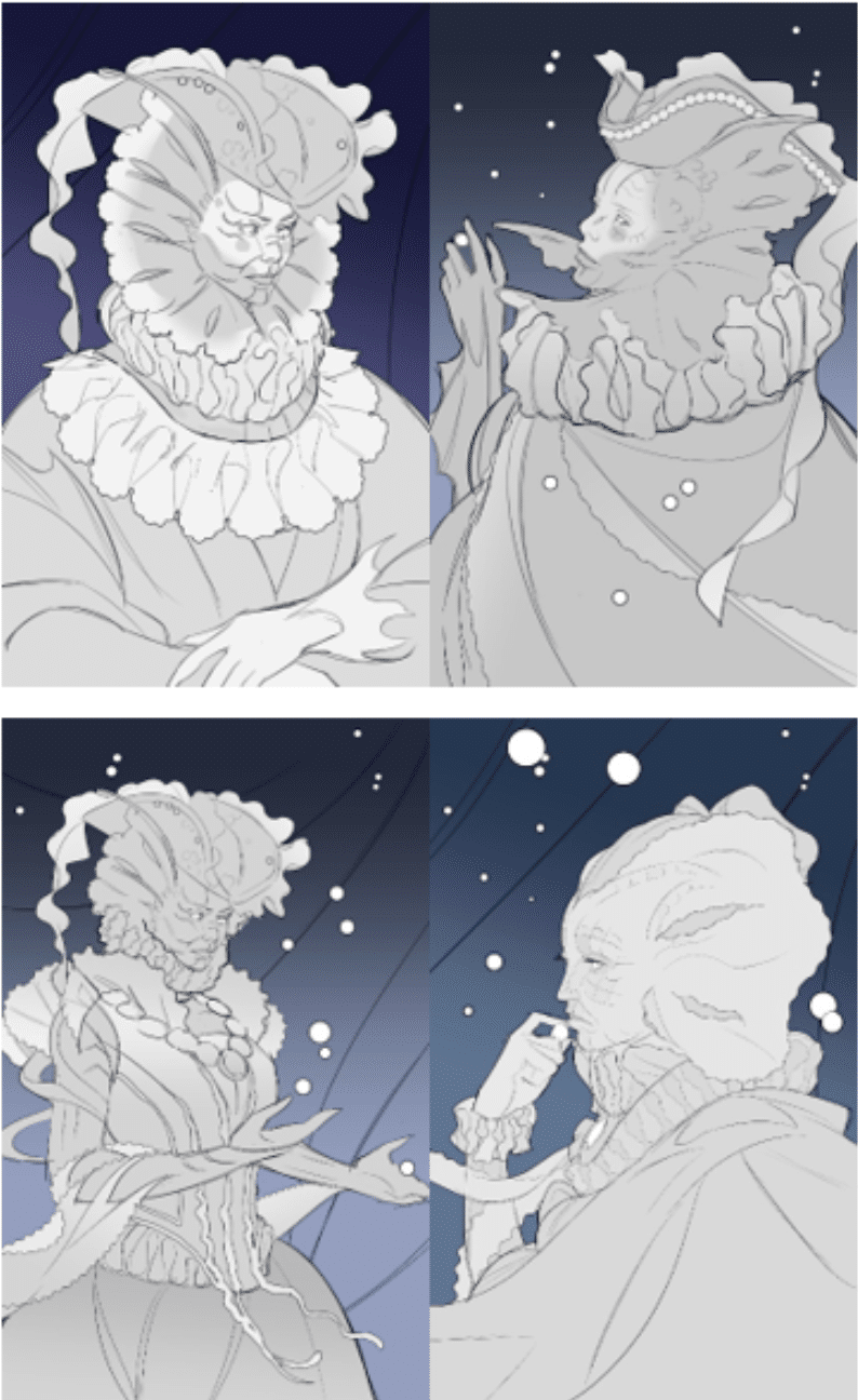
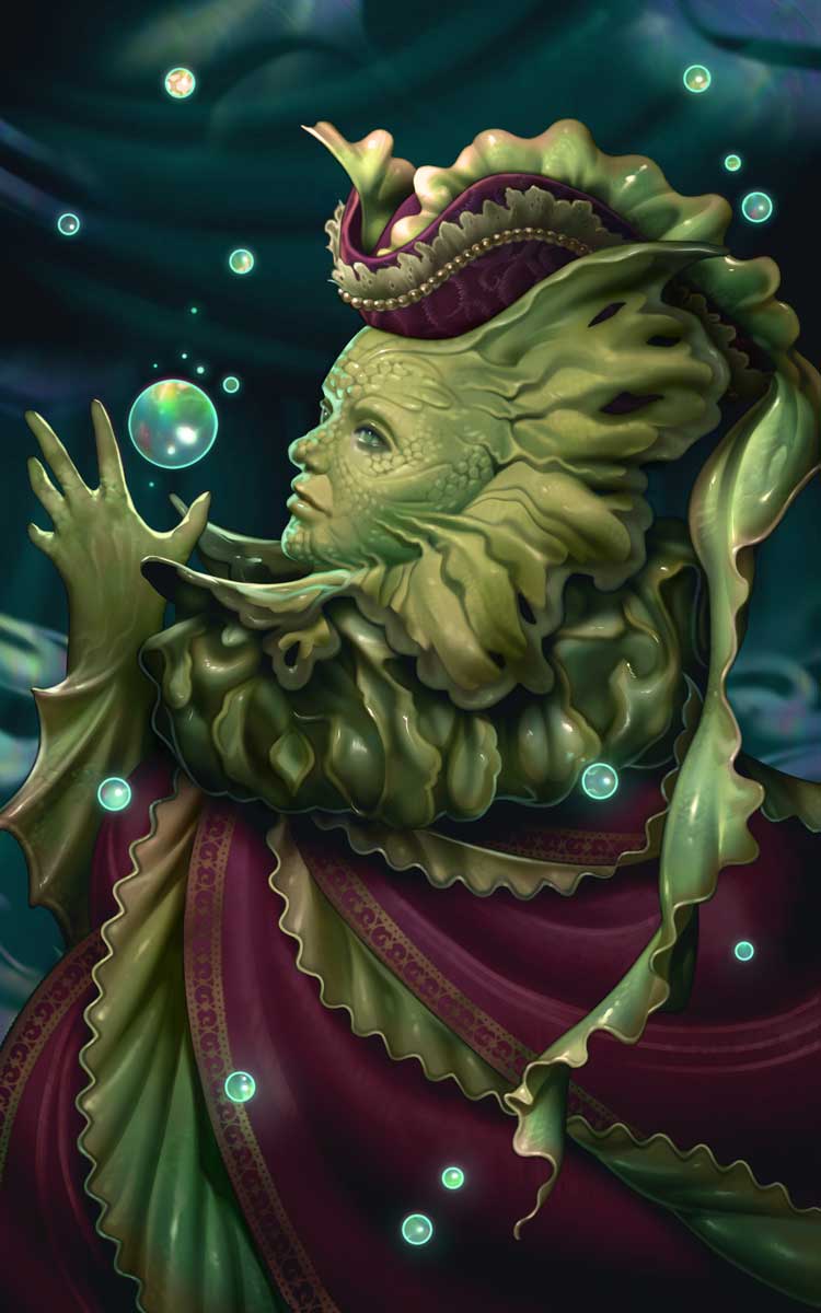
Four designs were produced and it was incredibly hard to narrow the choices. The first image had so many ruffles and a giant hat. Who doesn’t love a hat? The second image had the same character but with their back to the audience, showing off a lovely cape. The third image added full details of a dress, complete with jewellery. The final image was more pensive, David in thought, pose. After consideration, we chose the second image with its mix of the ruffles and the neck texture.
 The final image that Erika designed is delightfully murky with its deep greens, rich burgundy, and iridescent bubbles. When we finally revealed the cover this Issue’s Guest Editor, M.L. Krishnan took one look and said “I love that plankton lady.”
Wait. Plankton?
There’s a feeling you get when you arrive at your destination and it turns out to be something a little different than you expected? Instead of an ice cream stand, it’s now a homemade cider donut stand. And after a long drive, doesn’t a hot donut sound delicious right about now?
My dino lady seemed to have evolved during the course of her creation. Even though we had every intention of a reptilian dame who could spit in my eye (with my thanks), the frills became loose and limber like seaweed. The murkiness of the palette suited to the briny deep.
Creativity is a twisting path, even if you have a map you can’t plan for every eventuality. Whether she is a Dilophosaurus Duchess or a Plankton Peeress, our cover art is its own destination.
 Erika Hollice is our Artist-In-Residence for 2022. You can find more Erika’s art at https://www.eriart.net/
-
 Rebecca Bennett Owner/Senior Editor and Cover Art Director
As the sole Canadian, Rebecca spends too much time hiding her ‘eh’s and adding proper vowels to words. Her short stories and poetry have been published in Strange Horizons, Bourbon Penn, Luna Station Quarterly and other literary locales. You can follow her occasional tweets at @_rebeccab


