Throughout the issue, Chance can be interpreted in so many different ways. It can be the unknown, an act of blind faith, or the calculated gamble you take when the chips are down. Each finalized cover design has its own element of chance. When we pitch ideas to the artist, the design is influenced by whatever whimsy or interest floated our way during preliminary research. Olympic weightlifting, semaphore systems, ama divers, and galaxy marbles—all influenced our cover art.
Our pitch to Erion was inspired by the images and clips from the Oscar-winning skateboarding documentary Skateistan: Four Wheels and a Board in Kabul. Skateistan is an international non-profit that provides outreach, education, and safe spaces through skateboarding. An accompanying photo exhibition called Skate Girls of Kabul, by Jessica Fulford-Dobson, showcased girls outfitted in helmets, pads, and sometimes holding a skateboard almost as big as they were. The joy in the photos is tangible.
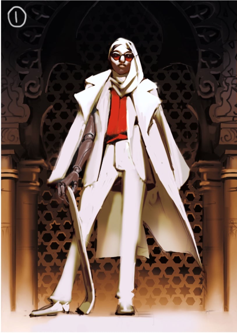
When I sent the photo board to Erion, I mentioned we were thinking about an action pose, showing a skateboarder in motion. Within a couple days, Erion sent back three concept images. The first, an older woman in a suit holding a skateboard. The second, a young woman on her board in front of a mosaic screen. The last was the action shot we originally described, the woman on her skateboard gliding down a ramp.
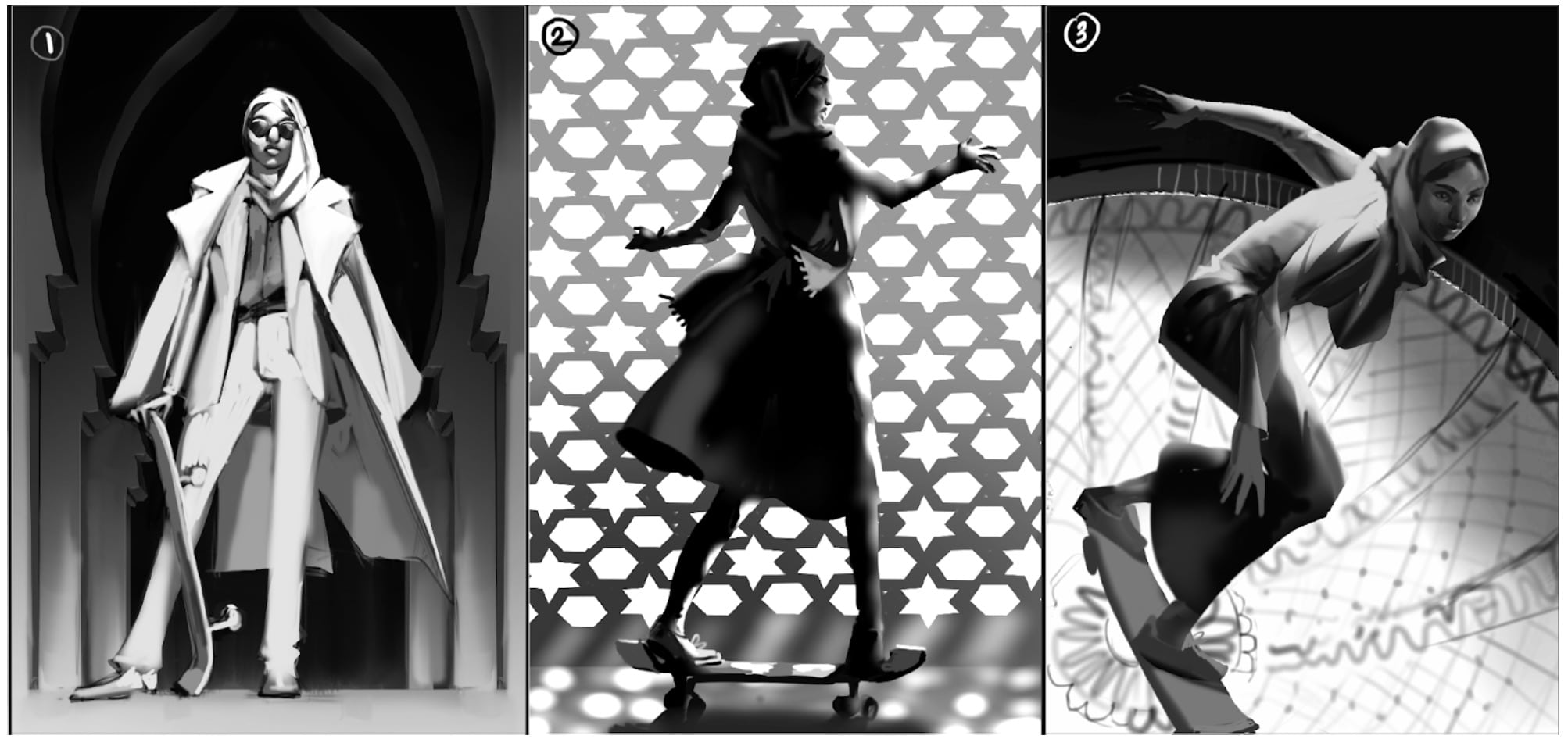 Erion took the initiative and researched different types of clothing styles to display in each image, from full traditional garb to the more modern pantsuit that some Muslim businesswomen adopted. While we had craved the action shot, it is a truth universally acknowledged that you can’t forget the commanding gaze of a woman in a pantsuit.
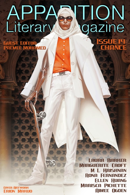
We asked Erion to move forward with the first image but asked if she would be willing to merge the background of the second image. We loved the textural element of the mosaic and the lighting quality of it.
The set of colour compositions that Erion sent were tinted yellow, blue and red. Again we were drawn to the pop of bright red in the first image. It reminded us of the first cover art that Erion created with us—the devilish pirate in a fluffy orange coat from Issue 6: Ambition. With a talent for drawing powerful women, we’ve always joked that if Pygmalion spouses ever became a reality, that Erion would be tasked with designing our spouse.
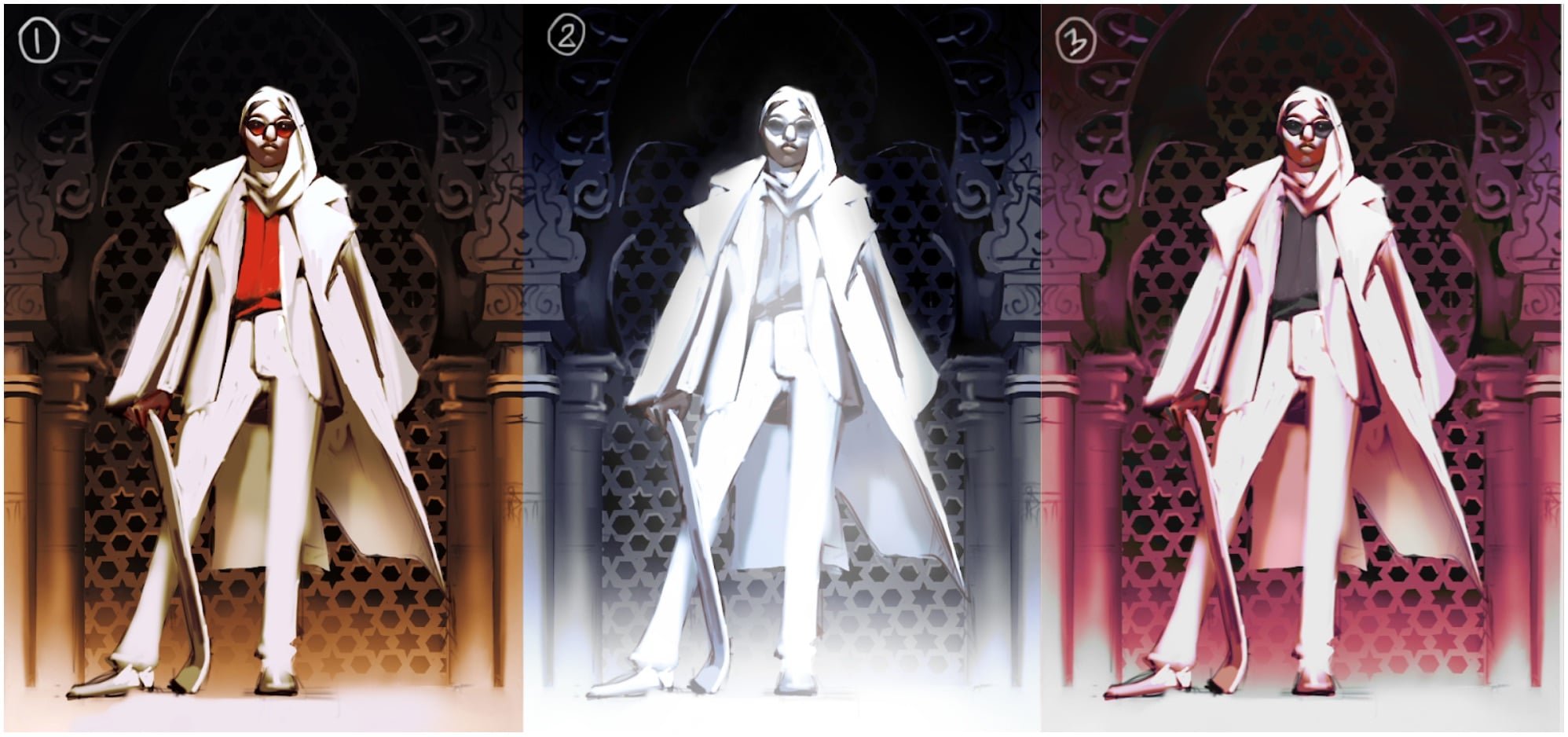 Colour ended up informing how the design was finalized. We needed a strong speculative element in the cover. The first thought was to knock the wheels of the skateboard and create a hoverboard à la Back to the Future II. However with the wheels off, the image still didn’t read speculative. I suggested to Erion that the skateboard would be glowly to read as magical or electric.
Clients think they know everything right? Erion very quickly let me know that, while she understood the idea to add a glow, it would create a ripple effect that would mess with the rest of the lighting and colouring in the image:
…one of the things that makes red pop so much is that it’s the only accent color in the picture so having blue on the hoverboard would diminish that. Also, under such bright daylight artificial lights usually seem very dim. So yeah, having an electric glow won’t break the picture, but it won’t help it either. I guess this is a choice between what looks good vs storytelling?
We wanted the colour pop–that was non-negotiable. After some thought, we suggested that, rather the skateboard, we transform the woman into the missing speculative element. We pitched an alien claw that would stretch the arm and distort the fingers. Erion responded with an even better idea, an old-school robotic arm with a ball joint.
The result was spectacular, the worn metal of the arm, the powerful draw of the pantsuit, and the implied play of the skateboard. It was a beautiful lesson on stepping back and trusting the knowledge of our illustrator. The final design isn’t an element of chance. Rather the opposite. One of the best parts of working with people you trust and respect means that the end result is always a certainty.
Interested in seeing more of the inspiration behind our covers? Check out our Pinterest boards where we post reference images for each issue.
Erion Makuo is our Artist-In-Residence for 2021. You can find more Erion’s art at their website: http://www.erionmakuo.com/
For more information on Skateistan, check out their website:https://skateistan.org/
Interested in seeing more of the inspiration behind our covers? Check out our Pinterest boards where we post reference images for each issue.
Erion Makuo is our Artist-In-Residence for 2021. You can find more Erion’s art at their website: http://www.erionmakuo.com/
-
 Rebecca Bennett Owner/Senior Editor and Cover Art Director
As the sole Canadian, Rebecca spends too much time hiding her ‘eh’s and adding proper vowels to words. Her short stories and poetry have been published in Strange Horizons, Bourbon Penn, Luna Station Quarterly and other literary locales. You can follow her occasional tweets at @_rebeccab

