Acts of redemption can quell the fires around you or incite them. When we commissioned the artwork back in February, the Australian bushfires were still fresh in our minds. The fires seemed endless; the haze of orange and burnt black wood was apocalyptical.
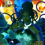
For our cover, we imagined a woman exiting a portal. The world around her is on fire but she remains collected. Her cool-toned magic protects her, and if she wanted, she could save the entire world. Magic lends itself to grace, so we searched for references of Black ballet dancers for the pose the woman would hold.
Magical places, unique character designs, and battles with larger-than-life stakes immediately grab my attention. And even though the characters are living under supernatural circumstances, their personalities and insecurities and flaws are completely relatable. I’ve always loved that.
Intrigued by the concept, Erika let us know that painting magical effects and striking poses were well-suited to her talents. One look at Erika’s portfolio will confirm this strength three-fold. Erika’s art is often jewel-toned with sound colour choices. After a few issues with covers that strayed toward the cool-end of the colour spectrum, we wanted an artist who would add pops of brightness to our standard teal palette.
 In Erika’s art, worlds come to life with her use of light and shadow. She excels at painting warriors and magicians–powerful characters who aren’t afraid to look the viewer in the eye. Daylight and the night’s dark are used to equal effect. Learning Erika’s background in game design explains her comfort with mise-en-scene and establishing full characters within a piece. Mise-en-scene is the french term for stage setting–the placement of items on a stage to tell a further story. On the whole, it’s comprised of five elements: setting, decor, lighting, depth of space, and costumes and makeup. It takes a skilled artist to render this 3-D format into a 2-D painting.
I spent a lot of time studying a variety of art styles, working with more contrast & color, and developing more flexibility. I wanted to grow my own personal style, without being totally bound to one method or aesthetic. I consider that one of the most important lessons I’ve learned during college.
Erika’s growth as an artist came from her education, where she collaborated with peers and began networking, and also from her hobbies. Erika is one of the hardworking few able to let hobbies influence a career. In 2016, she worked with Jacqueline Miller to produce a Dragon Age fan deck. They combined their talents to create a passion project after graduation.
It was our first time making a physical product from the ground up; all of our work beforehand was strictly digital or virtual. Despite those challenges, it was a fun experience! We were blown away by the positive feedback from fans, and we plan to do another project together in the future.
The next year, Erika was a contributing illustrator with Arcana Zine and Fortitudo, two curated Dragon Age publications that donated proceeds from their issues to charity. Friendship and collaboration drive Erika’s career. Though she enjoys her solo work, collaboration allows Erika to continue leveling up her skills and her career as she pursues more passion projects and large-scale design work.
Working in creative spaces boosted my comfort and confidence on both a professional and personal level. I’ve become a much better communicator and team player, and I owe a lot of that to my career path and the peers I’ve worked with over the years.
Q & A with Artist Erika Hollice
Standard interview question: where are you from, how did you start drawing?
I was born in Chicago and moved to the south suburbs when I was about five years old. My family loved to draw and paint, especially my mom, so my interest developed naturally. They were supportive of me every step of the way and didn’t hesitate to encourage me to pursue art as a career. I’m super grateful for their support. I earned a degree in game design and have now transitioned into the print & marketing field.
Collaboration and project development seem to be constants in your career. From Columbia College to now, how have you grown in working collaboratively with established groups?
I used to be very quiet and withdrawn, so I’ve changed a lot. Working in creative spaces boosted my comfort and confidence on both a professional and personal level. I’ve become a much better communicator and team player, and I owe a lot of that to my career path and the peers I’ve worked with over the years. I enjoy large-scale projects as much as my solo work.
In college you merged working as an artist to incorporate the practical necessities of video games to create functioning video game environments. With your work on internal-projects like The Intergalactic Traveling Monster From Space and Exiled, how did you adjust your artwork to work within a video game environment?
I had a muted and painterly style as an incoming student, which didn’t fit the themes and visions of the games I collaborated on during college. I spent a lot of time studying a variety of art styles, working with more contrast & color, and developing more flexibility. I wanted to grow my own personal style, without being totally bound to one method or aesthetic. I consider that one of the most important lessons I’ve learned during college.
In 2016, you spent over a year working with fiction writer/installation artist Jacqueline Miller to create a Dragon Age fan deck. How did you meet? How was it working together on a project for so long?
Jacqueline and I had classes in the same arts department, and we became roomates our sophomore year. The deck began as a casual project and evolved over time. We shared a mutual love for Dragon Age, and wanted to create someting special with our combined skills. Working on campus and attending classes left no room for passion projects, so we dived right into it after graduation. It was our first time making a physical product from the ground up; all of our work beforehand was strictly digital or virtual. Despite those challenges, it was a fun experience! We were blown away by the positive feedback from fans, and we plan to do another project together in the future.
You’ve created fancovers for some of Jacqueline’s writing. How do you create a cover for a story?
I make design choices based on the mood and themes of the story, along with the relationships between the characters themselves. It’s also great to bounce ideas off the author directly, digging into the world they’ve spent months or years building. It’s a fun process and a huge part of why I’ve been seeking more work in that area.
You were a contributing illustrator in Arcana Zine (2017) and Fortitudo (2017), two curated publications that donated proceeds to charities. How did find out about these publications?
By 2017, I was very involved with the online Dragon Age fan community. The curators were familiar with my work and I was lucky enough to be invited to participate. I was nervous to be included alongside so many talented artists, but it was worth the anxiety! Both books raised a generous amount for charity, and I couldn’t be happier with the final result. They have a special place on my bookshelf.
In 2018, you worked as a contract illustrator for Chimirus, a Chicago-based networking organization for artists. Your illustrations needed to accompany lesson plans, how did you incorporate education into your work?
It was completely new territory for me, but I had great guidance from Dave Pascuito, the CEO. He was my former professor at Columbia College Chicago, so I had the benefit of already knowing his learning tools & teaching method. The process involved a lot of communication and revisions. Creating tutorials is hard work, and important considerations have to be taken for accesibility and legibility. I came out of the experiece with newfound respect for artists who illustrate learning materials for a living.
Did working on lesson plans impact your drawing style at all?
Absolutely. Working on those tutorials helped me recognize the benefits of refresher courses and warm-up exercises. When I get stuck on a piece, remembering those key guidelines and returning to the basics goes a long way. It’s easy to forget that beginner lessons are always important, no matter your level of mastery. I think that applies to fields outside art, too.
What are some of your biggest artistic influences (both visual and non-visual artists, like writers and musicians)?
Music has been a huge influence on my process, and I always draw without a playlist of city pop or r&b running in the background. I’ve also been heavily influenced by game artists such as Jen Zee, Tetsuya Nomura, Sergey Kolesov, and countless others. Besides that, I’ve been taking better advantage of the showcases and galleries available to me locally, in Chicago. I’m especially excited to revisit the museum of the Art Institute after the pandemic ends.
Are there any personal elements (like family history or personal stories) that you try to incorporate into your artwork?
Yes! My favorite piece of artwork in my home as a kid was a large painting with little specks of gold spread throughout. When I learned how to recreate that foiling effect digitally, I made it a point to include it as much as possible. It inspires a little nostalgia in me. I get a lot of personal satisfaction from it.
I love that you create so many fanworks, to the point that you approach it professionally and create projects based around your interest. What does it take for you to become invested in a tv show/videogame/movie?
I’m really drawn to fantasy worlds. I spent most of my time growing up playing adventure-oriented imaginative games. Magical places, unique character designs, and battles with larger-than-life stakes immediately grab my attention. And even though the characters are living under supernatural circumstances, their personalities and insecurities and flaws are completely relatable. I’ve always loved that.
Colour and lighting are huge aspects in your work. This is why Tower (2018) stands out so completely in your portfolio. The Tower features a shadowed castle and almost grey-scale background (except for the lighting of the moon). What inspired this piece?
I created that piece on a snowy night in the dead of winter while re-listening to the audiobook for Six of Crows. It was a happy accident where my physical setting and the piece coordinated perfectly. I was also inspired by Katherine Lam’s work, and her incredible use of contrast and limited palettes.
What would be your dream project to work on?
I would love to recreate the covers of my favorite childhood books with a personal twist. It’s something I’ve wanted to do since middle school, but I never had the experience or the skills to tackle it. Now I do! It’s my next target, for sure.
Which of your works are you most proud of? Is there a piece you found especially challenging?
Right now, my favorite and most challenging piece is Dagger Master; and original work featuring a warrior surrounded by elemental daggers. It was the first time I recorded the full length of my painting process, from conceptualizing each individual weapon to rendering.
Last question! Do you have anything to promote to our readers?
My upcoming projects are still under wraps, so follow my twitter account at @eriartdotnet for future updates on my work!

