Omens are only really seen in the rearview. It’s something significant, best understood once something else has happened. It’s context and ignition. Two very disparate paths were proposed for Issue 19’s cover: a joyous wedding or a foreboding figure. We rarely line up cover design with issue themes. Often coming up with design ideas is a bit of a gut punch, it’s a quick feeling that grabs us by the belly and can’t really be ignored. It’s not like us to wheedle on a concept.
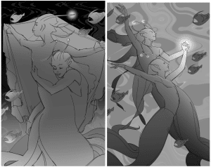
Generally when I toss the idea to Erika, I have an inkling of what I’d like to see. There’s a shifting form, fuzzy but still guessable. And if I had to be completely honest, I was hoping for that wedding scene. I wanted some creatures in love but couldn’t describe what they should look like. I threw out the idea of an angler fish, since who doesn’t love a mouthy glow-monster?
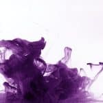
I think I hooked Erika with the idea of the angler fish. She took every murky concept I had and wove them together in her sketches. There were three wedding scenes and one, lone figure. In each sketch there’s the same angler fish, menacingly chomping at the scenery. For each of the romantic scenes, the partners are staring deeply into each other. The happiness and satisfaction were obvious. There’s satisfaction in the first sketch as well. It’s mixed with the promise of a threat that’s as clear as the promise of devotion in the other images. 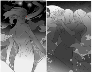
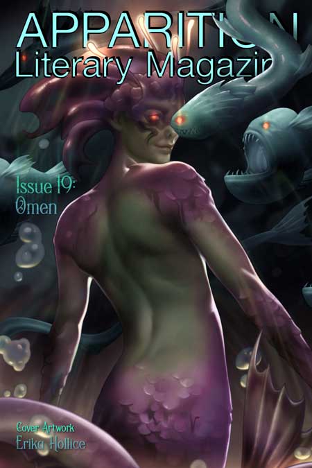
 A perk of working in a group that you get to experience other people’s joy and imagination. When I asked for everyone’s preference, they all picked the lone figure as one of their top choices. Yeah part of it was likely the glowing red eyes, but mostly Apparition Lit might be a thirsty bunch:
REDACTED EDITOR 1: Sexy eel sexy eel
REDACTED EDITOR 2: Ursula vibes but, like, if Ursula could steal my voice AND get me to be her frightened-and-intimidated-but-super-thirsting girlfriend.
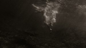
The eyes are what sell the cover, it’s an immediate showstopper: the placement of the eel, that glow. There are so many other little details that aren’t apparent at first glance. The obvious slickness of the eels, the translucency of the bubbles, the hint of scales, the muscles in the back.
I’ve been trying to narrow down the precise omen associated with this cover. What was the keystone that spurred the concept? The blinking left turn signal that hustled me further down an irreversible path? Maybe the path is too long. Maybe there are too many broken cobblestones, kicked over garbage cans, and open manholes for it to be a direct route.
As a millennial, I was definitely impacted by Disney’s The Little Mermaid. Yes, it introduced me to the concept of body dysmorphia too young and made getting married at 16 seem like a super great concept… but I think it resounds with my generation because Ursula was a fantastic villain. She was all business, it wasn’t personal. For me, the lasting scenes of that movie don’t belong to Ariel at all. It’s Ursula and her loyal eels Flotsam and Jetsam. Those eels terrified me as a child, the idea of something wrapping itself around you, holding you down underwater. Perhaps the omen for the cover was a shared one–a different Final Destination moment between all the editors that led us to choosing that one design. 30 years ago a child watched a movie, 2 years ago a tourist visited an aquarium, 6 months ago a bored office worker read about the Mariana Trench.
Who knows, we can only see it in the rearview.
Erika Hollice is our Artist-In-Residence for 2022. You can find more Erika’s art at https://www.eriart.net/
-
 Rebecca Bennett Owner/Senior Editor and Cover Art Director
As the sole Canadian, Rebecca spends too much time hiding her ‘eh’s and adding proper vowels to words. Her short stories and poetry have been published in Strange Horizons, Bourbon Penn, Luna Station Quarterly and other literary locales. You can follow her occasional tweets at @_rebeccab